

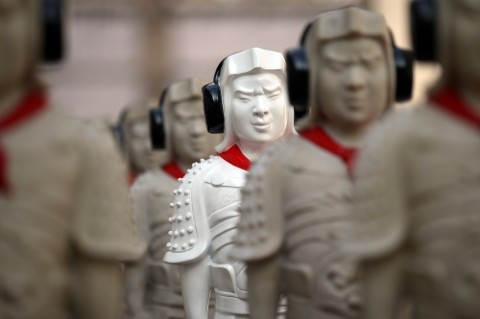
East & West Series: Globalisation (2008-2009), Justin Lee, Fibre glass
by Ho Rui-An
The National Museum of Singapore has come a long way. My faint memories of the museum before its redevelopment and rebranding appear more like ghastly images from a cluttered and badly propped movie set for an ancient horror tale. It almost reeks of a dusty, antiquated past, with its artifacts forcefully resuscitated from a medieval oblivion, like zombies displaced in space and time.
Museums started out as intensely private, personal collections of curios opened only to a privileged audience. In fact its precursors were the cabinets of curiosities that emerged in the sixteenth century. Even as museums eventually became institutions of public character that documented national consciousness, it has never quite demolished its alienating air of exclusivity, until its belated contemporary update recently. With each gingerly embalmed artifact encased in glass enclosures and protected by all kinds of contraptions, the image of a private, inaccessible vault of prized possessions belonging to some dignitary persisted in many museums for most part of history.
Like many other museums in the world, the revamp of the National Museum of Singapore in 2006 marked a watershed in local cultural history. The newly revamped interiors are the result of a classy melding of the old and the contemporary. More importantly, the extensive usage of new media and interactive technologies as well as the increased emphasis in fostering communal dialogue, have significantly allowed it to shed its authoritarian and aloof facade, to emerge as a fluid and participatory intellectual and cultural space. The museum is no longer just the possessive custodian of national treasures as it does not concern itself purely with the artifactual, but also with the generative possibilities of the human interactions that occur within and beyond its physical boundaries.
Without this context of a more open-ended and flexible museum space, it would not have been possible for the four site-specific art works on display now at the museum to materialise. The exhibition, Lost in the City, features the works of emerging young local artists. The works are strategically situated at various accessible areas of the museum, at times integrating into the museum’s architectural space. The physical, cultural and sociohistorical bodies of the museum are central to our appreciation of the works, particularly since the museum is a repository of the knowledge, experiences and memories of the large city it resides within. The works that leave the deepest impressions are those that articulately interrogate and contest its immediate surroundings, effectively constructing a new understanding of the tensions between a nation undecided about its existence and the museum that assumes its existence and documents its sociohistorical consciousness.
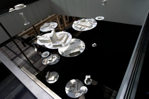
National Columbarium of Singapore (2009), Michael Lee, Bristol board
Michael Lee’s National Columbarium of Singapore confronts us with a particular urgency, particularly against the backdrop of recent political events concerning our perpetual identity crisis as a nation.
This is where most people make a mistake…I have tried to explain that we are different. We are a city. We are not a country.
– Minister for Law K Shunmugam, at the New York State Bar Association International Section’s meeting
The model-and-text installation consisting of constructed models of demolished, fictitious and unbuilt architectural structures suspended from the ceiling incisively highlights our anxieties towards our identity as a nation as constructed by official history and government rhetoric. While “city” and “country” constitutes a physical, geographical and demographic space, the “nation” is entirely an imagined community, perceived as homogenous and as possessing a set of values that are embraced by each individual in the community. These terms are often erroneously used interchangeably and carelessly, often to served various political ends.
The nation is a politically charged concept. Who determines its nature? The people or the establishment? Singaporean nationhood, as articulated by the officials, has been notoriously arbitrary, mutating according to the whims and fancies of those in power, to be brandished as a political instrument whenever the need arises. Consequently, the physical city or country is often employed as rhetorical muscle to legitimatise and concretise the abstract ideological constructs of nationhood. This can clearly be seen in the binaristic ideological categories of the “cosmopolitan” and the “heartlander” so often raised in public rhetoric. The former gains materialisation in the national imagination via images of the iconised city skyline while the latter is intractably associated with the unruffled comforts of the HDB estates. Architectural imagery are central to the conceptions and justifications of these questionably monolithic categories.
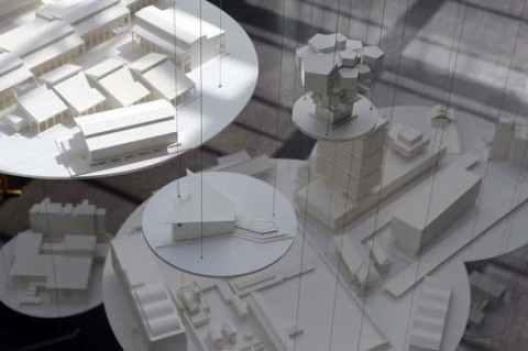
National Columbarium of Singapore (2009), Michael Lee, Bristol board
The demolished buildings are represented by 45 scaled models that are suspended from the ceilings like spectral beings making their way to the celestial realm, wrapped in an air of mystery, nostalgia and frustrated possibility. Like the unbuilt and the fictitious, they are the rejects of national history. (Were they too ugly, frivolous or deviant?) Collectively, they represent the death of a nation expressed as a plurality.Lee’s provocative installation piece appropriates the reliance on architectural imagery to challenge this pigeonholing of national identity. This is the columbarium of not just a physical city but a nation. Represented in the text and models are the physical structures, demolished, fictitious or unbuilt, that have fallen through the slips of national imagination and official history simply because they do not adhere to the officially articulated constructs of nationhood. Inscribed along the glass atrium stairwell are written records of these architectural structures, which include their lifespans, physical location and an interesting anecdote from various stakeholders. The installation integrates so seamlessly with the museum that we assume these nondescript texts to be, in accordance with the historical authority of the museum, entirely factual until we come across the incredulous. When did Singapore ever have a National Snow Factory or a Singapore Pencil Tower?! This melding of fact and fiction critically challenges the authenticity of official history as chronicled by national museums.
Located some distance away are Justin Lee’s fibre glass sculptures in his work, East & West Series: Globalisation. The work could very well have been a part of an exhibition called Lost in the Museum instead. Positioned at the glass passage that connects the old, colonial building with the new extension of the museum, Lee’s sculptures appear lost in the transitory passages of time.
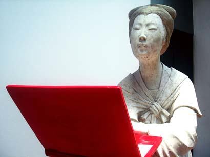
East & West Series: Globalisation (2008-2009), Justin Lee, Fibre glass
There is a small army of stout, diminutive Chinese warriors, modelled after the Terra Cotta Warriors of China. But unlike their derelict, crumbling originals, they are modern and fashionable, tuning in to the latest hits on their headphones. And there are the svelte Chinese court ladies flanking the army of little men. One poses elegantly like the next Miss Universe, while her contemporaries show off their latest purchases – a handbag and a notebook, both coloured red. Their ethnicity is grossly exaggerated. Their eyes are slanted and slit-like, invoking the racial slur of the chink. The facial expressions of the warriors are painfully strained and the rigid angularity of their form conjures the image of a population terrorised into submission. Farther away, two cranes appear lost among disposed Coca Cola cans, trapped within a pool of red, crass commercialism. Red, the auspicious colour of the Chinese is subverted here as the colour of vulgar decadence.
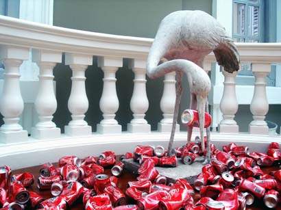
East & West Series: Globalisation (2008-2009), Justin Lee, Fibre glass
These mutated replicas of historical artifacts are cleverly situated at a location of immense architectural and historical significance. The Glass Passage is notably the only “modern intrusion” allowed by the Urban & Redevelopment Authority during the redevelopment of the museum, designed to blend into the old neo-Palladian architecture. With this new structure, one is able to view the exterior façade of the museum’s historic Dome from within the museum walls for the first time, enabling a clear, illuminating view of a historical past via a contemporary lens.
Such interactions between interior and exterior spaces, private and public realms, the old and the new and the East and West in Lee’s work comprehensively capture the intercultural interactions that characterise globalisation, where both provincial and imported ideologies are constantly being reviewed, contested and occasionally, assimilated. The artist’s take is frustratingly ambiguous, but that only serves to reflect our collective uncertainties about the exact value of globalisation.
Full Moon & Foxes (which also comes with a website – ed.), Genevieve’s Chua’s sequel to Raised as a Pack of Wolves, continues the artist’s examination of female adolescence. What puzzles me about the inclusion of this video installation in this exhibition is the irrelevance of site-specificity to this work. Situated in the enclosed and darkened room, the work essentially exist in an insular world of its own, bearing little or no association with its exhibition site or the Singaporean city.
The three panel video projection is essentially a montage of photographs and videos of female adolescents in the depths of the forests. References to nature are recurrent in her works, which essentially serve as compelling metaphors of the primitive, irrational and unfamiliar impulses that overwhelm us during adolescence.
Nature, ironically, is presented as uncanny and even artificial. The forest is a dangerous and claustrophobic space, appearing more like a subterranean world in which the girls can find no escape. The video unfolds like a horror movie – the bodily movements, if any, are slow and lobotomising, while the fading into blackness between each image insinuates an implicit, insidious danger. The surreal lighting and colours collectively contribute to an unsettling sense of artifice – the forest is no longer the domain of nature, for it has been transfigured into a theatre of concentrated adolescent awareness.
The brilliance of Chua’s works lies in a precise use of metaphors to articulate the most abstract ideas concerning the unknown. Here, the sinister full moon symbolises fulfilment – a coming of age fraught with fear, uncertainty and terror.
The work as it appears above would appear complete and satisfying on its own. Unfortunately, a set of barely visible arrows along the walls lead us to a hidden part of the installation, where we are invited to put on headphones to listen to a playlist of music that probably belongs to an “emokid”. It is almost akin to shoving teenage angst up our ears. In other words, emotional overload.
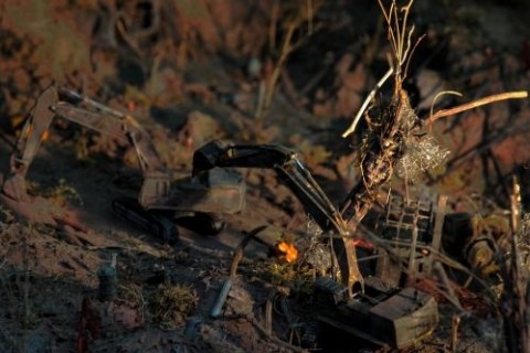
From Green to Brown to Black to Brown to Green (2009), Joo Choon Lin & Chun Kai Qun, Stop motion photography installation
Situated at the back of the Baroque staircase is a stop motion photography installation by Joo Choon Lin and Chun Kai Qun. Tucked away in the corner, the work resembles a child’s backyard experiment. In fact, it is this child-like quality in Joo and Chun’s previous works that creates a fascinating and original visual language. Their collaborative piece, From Green to Brown to Black to Brown to Green, which consists of a stop motion animation by Joo and a diorama by Chun, unfortunately, comes across as incoherent and childish. The animation shows the plight of a community of creatures whose homes are threatened by urban development.
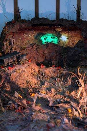
From Green to Brown to Black to Brown to Green (2009), Joo Choon Lin & Chun Kai Qun, Stop motion photography installation
While the diorama was used as a scene in the animation, its physical presence in the installation adds little value to the work. The installation is built to resemble a construction site and consequently a safety barrier is erected in front of the work. This proves to be a bad move as it ultimately deprives us of the chief source of satisfaction dioramas provide. We are put at a distance from the diorama and our inner gluttons for the finer details are left utterly dissatisfied.
Lost in the City is positioned as an exhibition in which the artists “play out their responses to the city”. However, it is difficult to conceive of an overarching narrative that the exhibition brings across due to the fact that there are effectively only four highly disparate works on display. Curatorially, the exhibition appears as lost as its title suggests. The collective effort at engaging with the complexities of city life comes across as anemic and this inadequacy stems from the fact that there exists so much more room for more critical and engaging works to be displayed.
Nevertheless, at least three out of the four works are illuminating pieces of art works by themselves. And the dynamic interactions that some of these works achieve with its environment is an encouraging testament to the museum’s potential as a viable site where art, ideas and conversations can be generated.
Lost in the City is an event of the Singapore Art Show 2009 and is currently on display at the National Museum of Singapore from 21 August to 3 January 2010. Admission is free.
~
Sorry, the comment form is closed at this time.
I am very reminded of Banksy by Justin’s work,
that juxtaposition and play of imageries that are visually witty but leaves nothing much to the imagination.
His usage of traditional chinese cultural icons versus modern ‘western’ cultural imports in such contrasting composition seem to reduce the complexities of modern china down to a “me, chinese cultural purity vs you, western capitalistic decadence/excess/blah blah” scenario, ignoring the symbiotic relationship China has with the western world, which, from the looks of it, seems to be coming out the biggest winner from globalization, making and playing by its own rules.
More ever, these traditional Chinese cultural icons have probably been decimated by the cultural revolution long before globalisation has.
Yes, I do agree that most of Justin Lee’s works have this deadpan quality, largely also due to the use of Pop Art aesthetics. The message is put across with a detached indifference – like a one-liner.
And I think this makes it excruciatingly difficult to determine whether the work views Western capitalist influences as an adulteration of cultural purity or a cultural import to be cautiously integrated into contemporary culture.
But instead of considering the inclusion of Western capitalist iconography as an adulteration, is it possible to see it as a kind of generative cultural hybridisation? The artist can also be seen as reinventing traditional cultural icons to reflect the kind of hybridisation that is happening between cultures.
There is a fine line between adulteration and hybridisation and I actually consider that latter to be something more positive and productive. After all, I think culture is inherently metamorphic and it’s quite hard to see it in terms of a prescribed set of “pure” characteristics.
One can look at his work via two completely disparate perspectives that are so difficult to be synthesised into one, cogent argument since they contradict each other entirely. This is perhaps an aspect of his work that I find to be really quite annoying.
Had Justin not included the usage of red in his installations, the installations would certainly have become simple one liners or crude binaries between ancient East (figures) and modern West (mass consumer products and media tech) but its been noted by the writer that the usage of red is highly ambivalent in pomo chinese culture (i.e. traditional festivities or Christmas? communism or capitalism? danger or courage?). ‘Red’ is the secret sauce that hides the poetic complexity that A.M seeks. If that isn’t enough, the usage of fibre glass may also be a kind of subtle pointer on the challenges of defining what is authentic in our day and age, or the possibility that something that a revolutionary ‘body’ hides under a form that looks old and stale.
Given the mass of information/propaganda that is already found in such a governmental institution, the physical simplicity of his pieces has another advantage in that it allows for museum goers to better integrete meanings or the aesthetics from surrounding artifacts. Should the pieces be taken out from a museum context and shown in a solo exhibition instead, its complexity will very quickly collapse like a Chinese coal mine which then I too would find the works to be really quite annoying.