

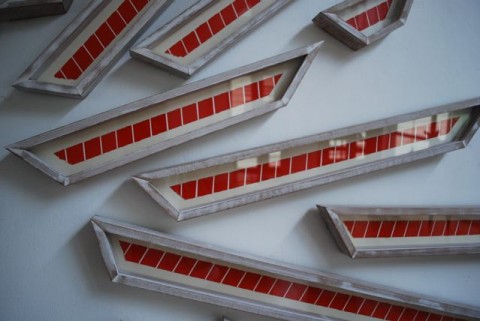
Detail: “The Sun / Red & White Stripes”, 2009, Acrylic on paper, size variable
Minimalist Painting is a rare sight in KL. The market, as we all know, dominates and drives our art scene, and it is still in love with what has become the oh-so-familiar, comfortable styles of Abstract Expressionism and Realism. But every now and again we get a glimpse, a whisper, a rumour of pure colour, of strong lines and reduced forms. It should be a reassuring site for art lovers and general audiences a like. A reminder of more meaningful, purposeful academic times in art production and of forms coveted by Ikea shoppers the world over
But despite Minimalism’s coercion / diffusion / confusion into everyday generic interior design, it still royally freaks us out in Malaysia. As a strand of the visual arts, its rejection of naturalism, inferred intellectualism (I know something you dunno ha ha ha ha!) and sheer secular simplicity is intimidating and unyielding to many. It reminds us of our horro vacui, or horror of the void, of humanity’s obsessive need for stuff, detail and mental distraction / stimulation. It’s too damn silent! The stillness, reflection and concentration required to engage seems to be beyond us at the moment. It is artistic meditation, and our agitated 21st Century minds can’t keep still for more than 5 seconds. And so this so called Western art of perceived nothingness, of distilled form and colour, regardless of its sophistication is just not cool enough for the masses be they of the art variety or not.
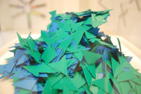
“Mountain & Water / Green & Blue Triangles”, 2009, Acrylic on paper, size variable
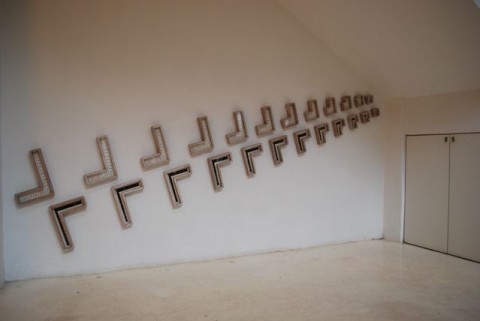
“Day & Night / Black, White & Colours”, 2009, Acrylic on paper, size variable
Which is why, Painting for All Ages / Painting With Extended Space: New Works / Concepts by Liew Kwai Fei (organised by VWFA at Rogue Art’s No. 19 Berangan space) was such a rare and special site. For those craving academic responses to painting, colour and installation, this show does not disappoint. Liew Kwai Fei’s abstract conceptualisations around colour theory, the purity of form, objectivity and space were well considered, rigorous and surprisingly for Minimalist work, welcoming. Warm even. Each work (made of acrylic on paper) intelligently occupied their space within spaces; whether framed, encased in Perspex, delicately torn into a swirling mass, or installed as intricate multi-part ruptures on the wall. Each was partnered with responsive creative texts by independent curator / writer and your very own ARTERI Managing Ed, Simon Soon. As such multiple conversations were able to take place throughout the exhibition: regarding text, architectonics, the gallery space, rhythm, surface, production, colour and much more.
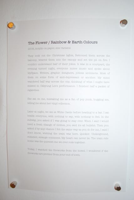
Simon’s personal reflections and memories inspired by Fei’s work all fall under the title of the art work it corresponds to. Titles are simple and divided by a forward slash; a textual division between the natural (“Mountain & Water”) and formal (“Green and Blue Triangles”). The written passages are lyrical, and slow paced. The relationships between text, both Simon’s (and the notion of text in general), and the artist’s work become interesting rather then cynical and pretentious, due to the intimacy of scale. Fei’s work although expansive are made up of unassuming diminutive blocks of colour, framed and framed again such as “The People / Colour & Colours”, and are put together in rhythmic ways of doing. Echoes can be seen from the artist’s algorithms of his previous show at Valentine Willie Fine Art in 2008. Mounds of small painted pieces of paper were cut into triangles: “Mountain & Water / Green & Blue Triangles” or torn into irregular shapes “The Building / Yellow & White & Red & Grey & Blue & Black” and reveal an obsessive commitment to both creation and meticulous finish.
The textual contributions, printed at A4 size on copy paper and found humbly next to the work are a good example of possible entry points into Minimalist work. Simon’s writing is both stoic and existential, emo and insightful. It will inspire some and bore others. Just like the work. But as a strategy it is unusual for KL and worth considering. And as a strategy it succeeds and has its limitations throughout the exhibition. The text is well written, the works are well executed. Together, they dance and sing to one another, but this can lock down meaning and give lazy viewers too much to think about it without the freedom to come to their own conclusions. Minimalism deals with universality, of the empowerment and amplification of form and colour without the hindering visual details of the natural world. So the textual journeys, with their descriptions of the human world are an interesting insertion into this debate. And perhaps such guidance is exactly what our audiences need to encourage more engagement.
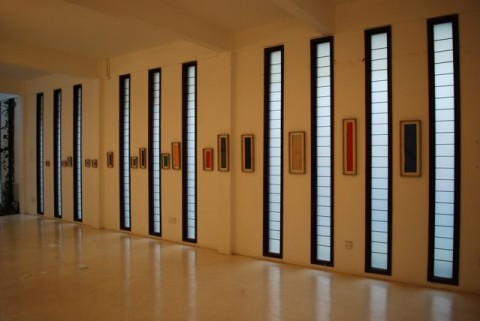
“The People / Colour & Colours”, 2009, Acrylic on paper, size variable
The idea of the work, the concept, is in what you see, and to a certain degree what you read. Which is why this type of work is so difficult. On one level, why are shapes, primary and secondary colours interesting? What does it mean? Where are the details? Why do I need to read about ‘dulcet moral pleas’? Well, you have to look, get past a sense of monotony and repetition, dive into or ignore the text. Have you ever heard the phrase still waters run deep?
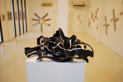
“Roadscape / Black and White Line”, 2009, Acrylic on paper, size variable
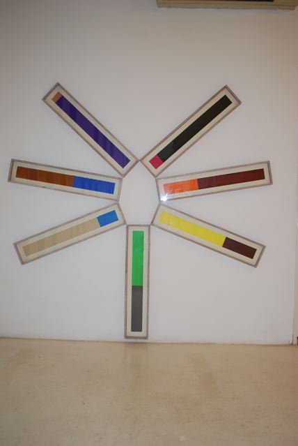
“The Flower / Rainbow & Earth Colours”, 2009, Acrylic on paper, size variable
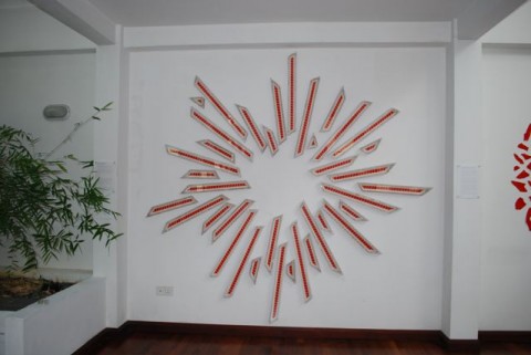
“The Sun / Red & White Stripes”, 2009, Acrylic on paper
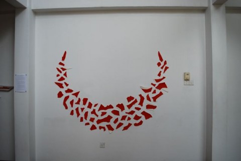
“The Boat / Red & White Irregular Shapes”, 2009, Acrylic on paper, size variable
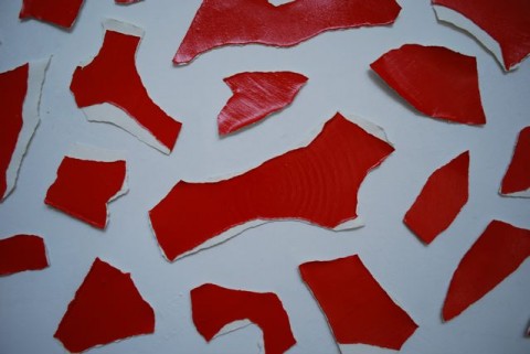
Detail: “The Boat / Red & White Irregular Shapes”
(EM)
Sorry, the comment form is closed at this time.
Firstly, let me declare my bias. In addition to having worked with Kwai Fei (back in my gallery bitch days), I wrote an essay for his second solo show ‘The Rhythm of Doing’. I also collect his work. Also, we are friends. He urges me to read Wittgenstein… which I haven’t.
With Simon Soon producing text for Fei’s latest show and Eva McGovern writing this review, seems fitting for me to complete this ARTERI trifecta with a response to the latter.
1.
I remember the first exhibition where I really learned to look. It was in the first year of art school. Our tutor brought us to see a show by Mladen Stilinovic, called ‘White is the Colour of Pain’. I didn’t know anything about art then – nothing about Minimalism, or Duchamp, or post-modernism, or installation. All I had was the ability to see. I saw funny little objects painted white – those whites had hues and textures that I’d never imagined.
There is something about art that makes you learn to look again, brings you back to your childhood when you could be fascinated by a square red box for hours. It’s an exciting, private, almost erotic, heightened experience.
I can still remember the creamy light of the gallery on that day, years ago.
There’s nothing ‘difficult’ and ‘academic’ about looking. Children can do it. They can spend whole afternoons doing it. That is why Fei’s exhibition is called ‘Paintings for All Ages’.
2.
These days there is a set formula for putting up exhibitions. You, the artist, makes the work. Then you think of a title for the exhibition and each piece. You write an artist statement that explains your work in words. And you invite someone (usually a curator, art critic or historian) to write an introductory essay in to be printed in the catalogue. Sometimes there will be text on the wall to help explain what is going on in your work.
Fei’s exhibition has no artist statement, wall text, curator’s essay, or catalogue. Instead, he has invited Simon Soon to write a series of personal responses to each work, these responses each fill up one sheet of A4 paper. They are stories, reflections and streams of thought. They don’t have any clear relationship to the artworks. They don’t use art jargon.
When I was young, they used to sell these paper stickers of geometric shapes in bright colors, which were basically like stamps – you had to lick the back to make them sticky. I really loved them. A red dot could be a planet, or the hole to hell (I was brought up with Taoist notion of very scary Buddhist hell). Blue triangles mixed with green was the sky crashing into earth because Atlas could no longer hold up the world on his shoulders.
I suggested to Fei that he should hold a workshop where people can choose how they will respond to his paintings, just like that invitation he extended to Simon Soon. I myself wanted to take the individually framed paintings off the wall and spend the whole day rearranging them into different configurations, different galaxies. That is why Fei’s show is called ‘Paintings with Extended Space’.
We’re offered an exhibition that isn’t propped up by the usual scaffolding that makes art ‘important’ and distant. As far I know, that’s a first in KL.
3.
The text is well written, the works are well executed. Together, they dance and sing to one another, but this can lock down meaning and give lazy viewers too much to think about it without the freedom to come to their own conclusions. Minimalism deals with universality, of the empowerment and amplification of form and colour without the hindering visual details of the natural world.
Minimalism.. it’s… I don’t know. In painting and sculpture terms, it’s a modern art movement that gained popularity in the Western world in the 1960s. It was perceived as a reaction to Abstract Expressionist painting like Jackson ‘Jack-the-Dripper’ Pollock’s. Donald Judd made plexiglass boxes. Carl Andre laid a row of white bricks on the floor. Dan Flavin made sculptures from fluorescent lights. Eva Hesse made Minimalism a little more human with her latex sculptures and humor.
Putting the Minimalist label so casually (lazily? – the cheap reference to IKEA aesthetic is especially hard to swallow) on Kwai Fei’s work is locking it down, in the same way Simon Soon’s text (or the idea, the possibility of his text) sets it free.
Hmmm, but did the oriental really ever fear void as much?
Hi Sharon,
Hmmm…. the Ikea reference is not about cheapening the quality of the work, which I think is powerful and thought provoking, and very important for viewers to see in KL. Along with the combination of the text.
It is about the fact that Art and Design dialogue. This then gets filtered down to the masses through popular culture. Meaning is then often mistranslated and ends up food for consumption. And so we then forget the original purpose which is fine/normal and good that many more people interact with threads and concepts but can also be a shame at times. It is more a comment on that then anything else and I think this is something we can’t ignore.
A Minimalist categorisation as a ‘lazy term’. Well perhaps and perhaps not. But then again categorisation is another inevitable thing. It is obviously limiting which I hate to contribute to as I want meaning to be open to multiple possibilities but it can also be useful as well. I want to talk to Fei more!!
E
Whether minimalism is a lazy term or a term that locks an artwork down towards a specific way of reading it depends on how we have come to understand what minimalism stands for. As a modern art movement or perhaps even many might argue the first postmodern art movement, its responses to abstract expressionism opens up so many possibilities and trajectories that it is hard to believe it is ‘limiting’ unless you’re talking about the formal repertoire which is of course, ‘minimal’ and ‘quiet’. Therein lies the irony.
What helped me understand minimalism most are not actually texts written by proponents of this kind of art but its detractors. Archnemesis critic/historian in Art and Objecthood describes minimalism quite scathingly as ‘theatre’. This is a brilliant and succinct encapsulation of what the artwork is about. By de-emphasising the authorial mark or gesture of the artist in an artwork, minimalist art reacted against the traditional notion of art as a window into another world. Even in abstract expressionist works, one is privileged into the emotions of the artist. Instead by working with fundamental forms, it brings our attention to the ‘object’ness of the work of art which leads to the consideration of the space around it and us as viewers engaging with it. This reviled ‘theatre’ is the everyday, the realm of human action, the realisation of us, our space, our engagement that Fried is so afraid will impinge and pollute the autonomy of the aesthetic space in art which is pure and self-existing.
In turn, minimalism is really the movement that opens up art beyond the limiting ways we engage with art. Installation, performance, earth art, are all legacy of ‘minimalism’. This might not appear to seem so if we chart the development on a formal level. But think of the possibilities of what this notion of the ‘theatre’ brings in. The above mentioned practices could not have taken form if this initial impasse wasn’t redressed through minimalist practices.
Hi artifarti, thanks for your comment.
Of all the modern art movements, Minimalism is probably one of the most misunderstood and scathingly dismissed a gigantic hoax. It’s a movement of ideas as much as aesthetics and I think that’s where the confusion lies for many people, especially audiences who aren’t up-to-speed on the history of modern art.
Installation, performance, earth art all bursting forth from the fountainhead of minimalism? Mmmm. Arguable. Very arguable. And a very modernist, linear way of thinking about the development of ideas. I’d say that throughout the history of art there have been attempts to bridge that gap between art and life. Surrealism? Dada? Those weren’t just chopped liver, wat.
I personally think Minimalism developed from the need to address specific aesthetic problems to do with the transition from painting to sculpture. Frank Stella and the Color Field painters like whats-his-face Rothko and that guy who made the black cross paintings were already a reaction to the sploshy, let-my-guts-out-on-the-canvas wank of abstract expresso coffee. But there was yet to be a reaction in sculpture terms.
Along with paint, abs-ex also vomited out the idea of art not just as an image, as you say, but theatre, a site where the act painting happens. You’re not looking at a painting as an expression of emotion or angst etc, but also as an object, a thing in space and time. Minimalism took that idea and pushed it to the absolute edge.
And etc. Seni untuk seni. Fascinating dinner conversation between art geeks, but that’s the limit of the potential of this kind of discussion… for me, that is. I’m not dismissing it entirely. Just saying… it’s a nice dessert, but I wouldn’t make it my meat and potatoes.
Hello Sharon,
You’re right that reading installation, performance from a minimalist trajectory is pretty linear and a gross generalisation but it is not quite so ‘modernist’ as you so put it to be. What about Surrealism and Dada?
We often forget how modern art history is divided by a caesura. This break was constituted by both a return to conservatism in art – the return to order in France, Neue Sachlichkeit, Russian Social realism, American realism followed so closely behind the first wave of avant-garde (surrealism, dada, constructivsm, etc.), and the tragic occurence of World War II which radically altered the cultural landscape of the West. Post war avant-garde could have drawn from pre-war precedence in terms of ideas and forms but by the sixties, they were working within a discursive system that prizes a rather conventionalised (by the sixties) Greenbergian notion of formalism and it was just as much a reaction to this newly minted ‘tradition’ that these disciplines (installation, earth, performance) gained popularity and accessibility amongst the dissatisfied.
I hope you don’t see this as a seni untuk seni discussion. The exploration of representational forms (and its development) and experience of art should not be misread as ‘art for art’, a term that has been much abused in this country. It is one of those terms that is redundantly bankrupt – mean so many different things to different people – that I like to see it banish from our vocabulary save its usage to describe a particular Parisian movement in the early part of the twentieth century.