
 Metropolis Warisan
Liew Kung Yu: Cadangan-cadangan Untuk Negaraku
Bustle Gallery, Galeri Petronas, KLCC
14 April – 14 June 2009
I’m convinced that the fascination with kitsch is driven by a complex feeling that displays just as much affection as repulsion for the subject. Liew Kung Yu’s one man show in Petronas gallery, Cadangan-cadangan untuk Negara Ku, is no exception – and I was trying to get this out of the artist.
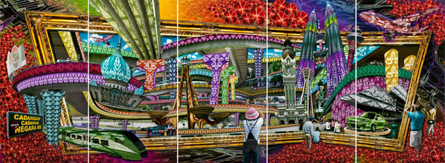
Less apparent than the usual cynicism one is bound to read into works that explore our local aesthetic and serve them up in hyper real mural scale digital collages, is an appreciation of the eagerness to engage with an audience through an identifiable and catholic vernacular. And when asked why, he said, ‘It’s simply because the aesthetic is a language that everyone in Malaysia understands and can connect with.’
Kung Yu’s process mirrors this concern. The cut out photographs are layered to achieve the three dimensional effects of Chinese paper craft, which was first explored in his Penang project back in the mid nineties where many of the works were displayed in the everyday everyman Chinese kopitiam (coffeeshop). Digital manipulation too becomes a tool for the aesthetic hyper real, a familiar form of contemporary communication in our ad-image laden world.
 Konkrit Jungle
But the scale in which Kung Yu works with in Cadangan2 also hint at a moral commitment associated with mural projects that normally instruct and impress upon the public the collective vision of a nation.
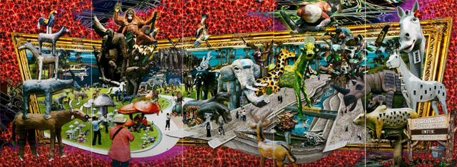
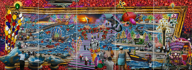
Sure, this garishness is compellingly disturbing to a certain degree – an animal park made out of concrete replicas, a cityscape woven together with gaudy mengkuang patterns, a disney-fied sea side resort; Nothing is real, but it’s not the Baudrillardian harp on simulacra that makes Kung Yu’s Cadangan2 interesting. It’s the ludicrous failure. As he leans forward in trying to explain this, I got a sense that it’s the farce underneath our national aspiration that captivates him. Searching for a phrase, he falls back to the Malay language, ‘Datin tak jadi.’
The research was painstaking. Long drives around the country, collecting photographic samples which were then compiled into three video slides shown on small LCD screens. They loop and repeat our familiar terrain, from kampung signboards to public sculptures, uncovering our penchant for an artificial idyll, often shamelessly borrowed from natural forms – concrete waves, giant clam, cement giraffe, colossal mushrooms.
There was disdain in Kung Yu’s tone, but he immediately got excited when he spoke about visiting manufacturing factories that mass produce our cultural landscape. This is where the magic happens. As if they are the very alchemical laboratory that could turn the very rubbles of our country into gold, or at least coat it so.
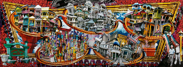
 Bandri Sri Tiang Kolom
I like Bandar Sri Tiang Kolom best. Residential homes with front columns in the tackiest of Classical taste grace the porches from millionaire mansions to the kampung house, cutting across the rich poor divide in a fervid embrace of high style. The work incarnates our desire for Roman order + progress, just as much as it exposes our poor aesthetic understanding of what these columns could potentially signify. We’re after all not a nation that appreciates irony despite our colonial past.
Whether public or private, these works celebrate just as much as they criticise, embracing the intensity of this aesthetic undertaking. It’s a campy look at our tragic visual vocabulary, but one that looks at it with a sympathetic eye and goads us on to reflect the implications of our cultural nationalism without the need to dictate the provisos of our engagement.
 Pantai Gelora Cahaya
~
Images courtesy of Studio Eighty-Eight
(SS)
Sorry, the comment form is closed at this time.
It’ll really be really spectacular if I could see one of these kitschy kaleidoscopic pop up panoramas next to Hoy Cheong’s epic monochromatic caricatural migrants drawings. What a blast!
Hey Si, are these works digital prints ie flat? Or literal cutouts?
The garishness of our Malaysian aesthetic (or should I limit it to Semenanjung aesthetic?) is something I always took for granted, until my husband visited Malaysia for the first time and made comments about the city aesthetic looking ‘faded’ and ‘sun-washed’, as the cars and houses were. He’s from New Zealand, you see, a place where people paint their houses every five years or something like that. Since he made that comment, I noticed that there was a lot of blue in our urban environment, too; that is, faded posters and billboards that have been displayed way too long (since cyan ink doesn’t easily fade). The aesthetic of non-maintenance lah.
“Less apparent than the usual cynicism one is bound to read into works that explore our local aesthetic and serve them up in hyper real mural scale digital collages,…”
SS are you referring here to those billboard adds ala ZOOM?!!
I think Kung Yu’s work visualizes Benedict Anderson’s ‘rooted cosmopolitanism’ and his ‘mongrel tougue’. Its all play with language of the very very familiar.
Kitsch to me is so very powerful cause yes it is that “complex feeling that displays just as much affection as repulsion for the subject” (KY makes me love what i hate – like WOW!) but it necessarily feeds off something else which is public KNOWING. A communal shared language of place. And the language is exciting because it is inclusive of all elements on that landscape. I mean like kitsch language is exciting cause it embraces ‘actual’ language, visual aesthetics, habits, national policy, hopes, aspirations, failures – the whole shebang. It’s just gotta have a bit of the epic to it and KY’s Cad2 hits that Susan Boyle high for me.
And i love the naughtiness. Kg Kolom ie column ie slang for err being choked by something ie aircon to be encircled by ribbon cutting wahuahahhahaha!! That’s just brilliance!
Hi Lyds, they are layered cut outs, so they look a bit like pop up books on a gigantic scale. it’s quite amazing seeing those works in front of you. unfortunately, as usual, the images don’t do justice la to the formal complexities of the work.
Ilann, i’m was referring to common trend of reading of art works that employ a kitschy vocabulary as a cynical response to our popular culture without acknowledging the celebratory, playful and as you said it ‘naughty’ nature of playing with kitsch. What is ZOOM? :P
I love your sentence, ‘kitsch is an actual language…’ because it is truly a common denominator of mass culture. Don’t you just love those photo evidence of our aesthetic language Kung Yew so nicely compiled into a slide? There’s so much love and affection in this project and yes, that’s the amazing bit about kitsch huh?
What I liked so much about the work is how it straddles the digital and actual making. The meticulousness of putting the composition together with the physicality of how the images are built up in the cuts outs and the framing device of the plastic boxes. Really sophisticated and so much fun. And it looked beautiful in the space.
Actually Kung Yu should make a pop up book!!
Simon ZOOM are those Malaysian tourism ads where the OO are kinda like binoculars (or an equally warped ‘frame’ like the gilded frames in KY’s work) and they zoom into various ‘worthy’ destinations around Malaysia.
Yeah i love the slide shows. They confuse me. dont know whether to laugh or cry. And yeah this show is all about LOVE!
Kudos to Galeri Petronas for putting up a great show and for giving a space to contemporary arts. Audiences are richer for it. Wish they had a catalog i could take home though.
Eva maybe KY can make a pop up book / catalog and sell at MPH! Am sure it would be super popular. Might even replace ‘Fatimah’s Kampung’ as my standard birthday present / gift of the year.
I’ve never been to Malaysia but this is how I imagine Malaysia to be this whole kitsch-ness and fantasmogorical landscape with layers of old and new. I wonder if this is somehow connected to the layers and mishmash of Malay, Chinese and Indian culture and tastes and willingness to embrace different world views all driven into the same vortex. Also a mirror to the postmodern and global world we all live in but with a very Malaysian flamboyance.
I like that expression “language of kitsch”. The works from a compositional perspective all seem to have circular motions like how kitsch objects/design almost have a selfconscioiusness about being kitsch. It also remind me about the arguments about kitsch(high/low art) which in itself goes around in circles. At the end of the day its all really playful and doesn’t take itself too seriously.
I really like this work!
Btw Simon (and hi Lydia ) I really like the comments and discussions that evolve out of art postings. Feels almost like the questions and answers component of lectures.
Hi Yuye! :)
Thanks for popping your head in all the way from Sydney! :)
Well Malaysia is NOT that bad :P Having said that, it is quite fantasmogorical although i’m not entirely sure it’s because of the mishmash of culture. More like just bad bad bad bad bad taste probably. Interestingly enough, there was a local artist protesting against the works, wanting the gallery to take down the exhibition because it was deemed to be offensive and insulting to the country! Can you believe it?
And I thought this work embodies one of the most complex form of love for the country I’ve seen in a long while. And you still get people reading it as an insult. Man…
– simon
I thought it was awesome. One of the strongest shows I’ve seen recently. It was a good choice to display them in a curved room, I think that subtly helped deepen the three-dimensionality of the pieces.
In a way, the detail and humour of the works allows you to engage them as if you were in a theme park of visual delights, so there’s a subtle doubling of the subject matter in the viewer.
Like I-Lann, I find this stuff aesthetically horrendous in real life, but they are beautiful and fascinating here. It’s love, tainted love! :P
But seriously, its perhaps that there seems to be so much more thought and care put into KY’s works, whereas the counterparts of these simulacra strike me as the products of little or lesser thought and indifferent execution.
I am all for a Bandar Sri Tiang Kolom pop-up book! But make sure the architecture students don’t take it too literally…
I think many good artistic use of kitsch has a third element, besides being cynical and celebratory.
Kung Yu’s kitsch has always also managed to be surprisingly poignant – it is a pathos tucked under the cynicism and celebration, almost appearing like bathos, except for when we look at it and realise the spectacularly tragic joke the country has landed us in. Kung Yu throws up on us the contents of our own undigested aspirations, vivid as toxic beads. In Kolom he captures how we want to live, our roofs suspended by our vertical desires, our desires suspended by market forces. Our ideal home, our better future, all our dreams, settled on this. Cheap. Pretty. Good enough. Common. Nice. Good enough.
Cynicism leads to denial. Celebration attempts an embrace. Poignancy takes me back…
I remember his headless monster with sinews consisting of Petronas Twin Towers in the National Art Gallery in the mid-90s.
In a land that offers nothing more substantial than the achievement of the temporarily tallest towers in the world, columns are all we can dream of. How can we fashion ourselves better dreams? This is what Kung Yu’s proposals are to me. Not suggesting something new. But what we already are. Do we really want this, he asks. And if we do, can we do it with some sense of irony please, thank you very much.
[…] here, the artist just about gets away with it through the agency of kitsch and graphic playfulness used to weave many (dense and shallow) ideas together. This is a […]